7 Color
Color or Black and White?
Another decision cinematographers must make early in the process, in collaboration with the director, is whether to record the image in black and white or color.[1] For many of you this may seem more a question of history. Stereotypically, old movies are black and white, while modern movies use color.
Once the technology allowed for color cinematography, why would anyone look back? But there are a number of reasons why a filmmaker might choose to film in black and white over color, even today. They may want to evoke a certain period or emulate some of those “old” movies. If the subject matter is relatively bleak, they may want the added thematic element of literally draining the color from the image. They may want to take advantage of the heightened reality and sharp contrast that black and white cinematography provides. Or maybe they want to foreground the performances. One of the greatest directors in cinema history, Orson Welles, once said black and white was the actor’s friend because every performance is better without the distraction of color.
We get it, though. It’s not 1920. You don’t ride a penny-farthing bicycle or listen to music on wax cylinders. Why would you watch a movie in black and white?
Maybe this video from Rocket Jump Film School will provide you with some compelling reasons:
Whatever their reason, cinematographers must take several things into account once they choose between black and white and color. First, if they are shooting in black and white, they typically have to use a film stock designed for black and white imagery. It is possible to print black and white from a color negative, but it won’t render the light and shadows in quite the same way as a dedicated film stock. Of course, if they are filming in color, different film stocks from different manufacturers will render colors differently depending on the desired effect. If they are using digital technology and want the final product to be black and white, the color is usually removed after filming in post-production. They still have to balance lighting and exposure for how the image will render without color. In either case, it’s important to note that black and white cinematography requires just as much attention to detail in the filming process as color.[2]
Color Temperature and the Effects of a Film’s Color Palette
We should also recognize that light comes in a range of temperatures and colors that affect the look and feel of a film.[3] Measured on the Kelvin (k) scale of temperature, the lower the K, the redder or warmer the light, and the higher the K, the bluer or cooler the color of light becomes on the screen. Light thus moves from a spectrum of reds, to yellows to white and blues the hotter the temperature becomes on the Kelvin scale. The director of photography can use light to heighten audience emotion through their instinctive reaction to certain colors, and thus lend new visual layers to a film.

Kelvin Color Scale
Red, for instance, is a color that instantly triggers in an audience cultural understandings of anger, violence, passion, madness, and love, aligned as it is with the universal color of blood. Using a shockingly dominant color, Stanley Kubrick paints the screen red with light in the climax of 2001: A Space Odyssey (1968) where supercomputer, Hal, sings his swansong “Daisy Bell.” The self-aware A.I. has killed everyone save astronaut Dave Bowman on the ship. Even though the color red emanates from Hal’s motherboard and ever seeing eye, it is Bowman who is painted red by the lighting as he deactivates Hal positioning him as a murderer as he effectively kills Hal. We are made to sympathize with Hal’s fear as his mind slowly slips away in a scene quiet but for Hal’s pleas, Bowman’s brief but earnest replies, and the atmospheric sounds of breathing and space. The intensity of the moment is amplified through the colored light, where strangely, despite the emotional tenor of essentially watching a sentient computer die, the color red feels cold, rational, alien.
2001: A Space Odyssey
Lighting for color can create a veritable cinema of the senses for the spectator. The notion of mise-en-scène is invested in the director’s control of what lies within the cinematic frame, and lighting is essential to the composition of a scene.
Hero (2002) is a story about the assassination attempt on the King of Qin told from the point of view of a nameless assassin. In Hero color is used as a narrative device to make clear the four different stories being told by the Nameless to the Emperor— the first in monochrome, the second in red, and, as we come closer to perceiving the truth, the third and fourth stories adopt the colors of blue and white respectively. Zhang uses his lighting to emphasize the specific color of the story being narrated, and to subtly communicate the emotional valences of the scene. In the third story, for example, remembered in blue, Moon, the pupil of master swordsman and assassin Sword is framed against the stark blue sky. Moon has lost her mentor, Sword, to the politics and violence of empire building. The three-point lighting illuminating Moon’s face holds a blue tinge. The sorrow and sense of loss expressed by her countenance is enhanced by the delicate lighting, the character’s stillness, and the mournful music that plays over the image. Blue, though, can also be read in terms of serenity, peace, truth, and challenges the way in which we are meant to understand this moment. Below, Phillip Colon explains the use of color in Hero.
Phillip Colon on color in Hero
Color in Zhang’s film highlights the perspective, tone, emotion, themes and very malleable aspect of story, while lighting allows us access to the implicit feelings of different characters. While color is not traditionally thought of as an element of mise-en–scène, it is often beautifully utilized by directors to develop story and meaning within their films. Wes Anderson, for example, is known for the bright color palette that demarks his film sets and characters’ costumes. Anderson’s color thematic allows the spectator entrance into quirky fictional worlds where color is an extension of characters.
Studio Binder on color in Wes Anderson’s films
Color can also be aligned with gender expectations, in that we associate certain colors with women as compared to men, political and religious affiliations, and other cultural representations. Directors have also used color to delineate transition and change, as illustrated by The Wizard of Oz (1939) in which a young girl from Depression-era Kansas becomes lost in Oz, a land of dreams. The reality of Kansas is depicted in black and white (actually sepia brown), while Dorothy’s dream in which she comes to emotional life through her adventures in Oz is full color through the technical achievement of Technicolor.
The Wizard of Oz
It is clear that color can have a deep emotional and visceral impact on the spectator. In the historical drama, Schindler’s List (1993), director Steven Spielberg decided to film his 3-hour epic about Oskar Schindler, an ethnic German who saved thousands of Jewish refugees during the Holocaust, completely in black and white save for one moment when Schindler sees a little girl in a red coat wandering lost and alone within the madness of the Holocaust as people are gathered and gunned down around her. Color here is used for dramatic impact, and to place us within the mind of Schindler, as he and the audience alone seems to see the little girl who slips past the violence. It is in this moment that Schindler commits to fighting the atrocity of the Holocaust. The use of color focuses our attention on the child who humanizes and stands in for the mass of victims whose lives were destroyed during the Holocaust. The bright blood red of the jacket becomes a beacon in the black and white world of Krakow and concentration camps that Schindler will continually catch glimpses of throughout the film, and signal the deep stain that marks the hands of the many who knew about yet ignored the Holocaust until war touched their own shores.
Schindler’s List
Color can act as an important part of the narrative, and present alternative dramatic ways of examining history. Pleasantville (1998) tells the story of two siblings who become trapped inside a 1950s sitcom set in a picture-perfect Midwest town. As in most films of the 1950s, the people of this small town exist literally in black and white, and, as emotion, sexuality and life begin to bleed into their lives, people and their surroundings become colorized, causing social fears and violence to erupt. Color slowly spreads throughout the black and white town showing every person and thing touched by the changing times. Color here also becomes an allegory to work through collective memory of race relations in 1950s America. There are no African American main characters, but as the people in the town begin to target the “coloreds” in the town with hate crimes and restrict them from social areas, the use of color within this black and white sitcom world embedded in a culture of repression and social ideology, forces into sight a conversation about race, history, and cultural memory in America. Without the storytelling device of color, the narrative of Pleasantville cannot be communicated aesthetically and effectively to the cinema audience.
Pleasantville
The History of Color Photographic Test Cards and Racial Bias
It is also important to understand how bias impacted the use of color in motion pictures. As late as the 1990s many studios used Kodak “Shirley cards,” depicting photographed white women, to determine “universal ideal” skin tone markers to help professional film developers calibrate color in the processing of their photographs. While effective for white skin, darker skin tones fared poorly under such a racially exclusive technique.[4]
Vox on the history of racial bias in color film
In the 1950s, cameras and color film became cheaper and more available for anyone to use.[5] The companies that made photographic film and the printers that produced photographs from the negatives required methods for testing whether the color was accurate and realistic. At that time, the Kodak company had a monopoly on color film and photographic printing in the Western world.
The method of color testing for photographic printing used images of people (usually women) on the test cards to ensure skin tone was accurate. This was problematic because Kodak originally only used models with white skin as testing controls. This means that there was bias in the way color film presented people with darker skin tones.
These test cards were known as “Shirley cards” because that was the name of the original model used in the Kodak skin tone standard cards.
It wasn’t until the mid-1990s that Kodak developed a multiracial Shirley card, but this was partly because companies that manufactured chocolate and wooden furniture had been complaining for years that photographic prints weren’t showing enough variations in the dark brown tones of their products.
Fuji film became the film of preference for photographing darker skin tones at that time, possibly because their color processing favored a different range of skin tones.
It is fair to say that early color film and printing techniques didn’t have the same range of color dynamics as we have now and couldn’t produce the best tones across all skin types. It is evident, however, that the way chemical processes were developed at the time favored showing light skin tones more accurately than dark skin tones.
More recently in cinematography, colorists have developed digital color grading techniques to better represent all skin types without losing quality or stylized color effect. Some significant examples of using color grading in moving images to portray dark skin tones include the films Moonlight (2016) and Black Panther (2018).
Historical Uses of Color
Although many people associate the silent era exclusively with black and white film, color technologies in photography and film existed since in the late 19th Century, and attempts were made to create realistic and accurate color representation in photography and film.
Filmmaker U on the history of color in film
Color grading is the manipulation of color to emphasize or desaturate certain colors and adjust contrast, shadows and highlights. It is used to enhance the mood, emotion, or visual style of an image or film. The practices of color grading and color correction began with traditional photography and film and continue to this day with digital media production.
For an overview of color technologies in non-digital photography and film, Barbara Flueckiger’s website is an extensive resource of over 250 individual film color processes, from tinting and hand-coloring to contemporary color film processes.
You may have seen old movies that list Technicolor in their credits, such as The Wizard of Oz or The Red Shoes (1948). Technicolor is a trademarked process for color motion-picture that dates from 1932. The original process captured three black and white films at once using a very large and cumbersome camera with a light-splitting cube to capture red, green and blue light on each film. It then used a dye process to produce an opposite color print – the red film becomes a cyan print, the green becomes a magenta print, and the blue becomes a yellow print. When the three-color films were laminated together, they reproduced something close to natural color.
Watch this video from James Layton and David Pierce for more details about the birth of Technicolor:
James Layton and David Pierce on Technicolor
Color Grading and Color Correction Techniques in Digital Photography and Film
You may have already used filters on your own digital media to adjust and enhance the color of a photograph or video for social media or before you print it. Most image-capturing apps now have a range of color filters that can immediately change the look of your image in many ways.
This is simple color grading, and the same principle is applied to professional photography and film – although the processes can be much more technical and customized. Almost all films and TV series have color grading applied to them. It can be surprising to see the original footage captured in the camera compared to how it looks postproduction.
Color grading example with increased saturation and contrast: before and after.
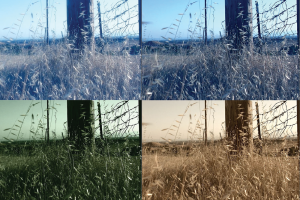
Variations in post-production color, by Chris Ace Gates
Color grading in film and video is an art, and colorists are skilled in manipulating color using a range of digital techniques.
Color correction is not the same as color grading. Color correction involves fixing problems with the original captured imagery, like editing out skin blemishes or matching color between different scenes in a video, for example. Color grading is more about the overall color and visual style of the image or video.
You might have noticed that some movies you watch have a lot of deep blue and green tones, while others might have orange and cyan tones, very black shadows, or very vibrant reds. With color grading, deliberate choices are made to adjust the hue, saturation, contrast, highlights and shadows of still or moving images to enhance drama or match visual themes.
All image and video editing applications currently used in the digital media industry have color grading tools.
Run N Gun Photo on the difference between color correction and color grading
Color Palette
A color palette is a set of colors that a designer or artist chooses to work with on a project like an image, website, fashion range, product packaging etc.[6] Color palettes aid cinematographers in creating a visually cohesive film and can even assist in characterization (think of the contrast between Batman and the Joker, for instance, or Clementine’s ever-changing hair color in The Eternal Sunshine of the Spotless Mind, 2004).
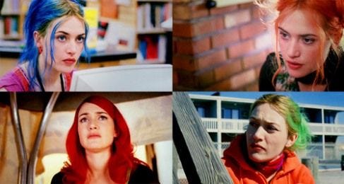
Clementine’s hair in The Eternal Sunshine of the Spotless Mind
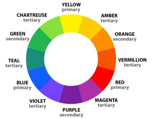
Color wheel, Jacob Olesen
A color palette can help reinforce a film’s overall mood, and variations in color across scenes can also reflect or track momentary changes in that mood. Basic color theory suggests that certain colors, such as red or yellow, elicit “warm” feelings within viewers, while others, such as blue or or green, are “colder” and thus produce more detached, or even sad, emotions within an audience. Luke Leighfield’s site explores a variety of common color schemes in film, and the video below discusses how DPs use color theory to create an emotional reaction within the audience.
The Verge on film color and emotion
Color schemes can also enhance a film’s theme (e.g., The Matrix, 1999) or or serve as symbols (think of the green light in The Great Gatsby [both 1974 and 2013], for example.) Choosing the right set of colors can play an important role in how successful your design, artwork or product is and how users respond to it. Color perception and aesthetic taste are subjective things, but colors do have common links to our emotions and moods.[7] Any artist or designer will have their preferred palettes for working with specific projects.[8]
Gels
Gels, also known as color filters, help cinematographers manipulate the color of a shot or scene. In the early days of film, directors would use glass, colored gelatine (hence, “gel”), and other methods for manipulating lights. Today, some cinematographers still use physical gels (now made from polycarbonate or other artificial materials), but many take advantage of computers to alter color.
As seen in the video, extremely strong gel effects are used infrequently.[9] It is their scarcity, however, that makes them all the more striking when they do appear, as in these two examples below:
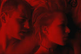
Run Lola Run (1998)

Blue (1993)
Most often gels are used for more subtle effects, but they are almost always in use. In fact, colors of gels go through periods of being in or out of fashion, and one way to identify the period of a film for someone with a better eye than I possess would be to identify the gel being used. Blue gels (and additional color gradation) were commonly used in the first decade of the new century, so much so that it became identified as an overused trope in popular criticism:
Despite criticism of their overuse, gels remain in use today, especially in a lot of “gritty” television drama. The rise of digital film, however, often renders gels unnecessary, as similar effects may be easily added in post-production.[10]
Common Uses of Color
Schemes
Cinematographers may arrange colors in order to create harmony or incongruity/chaos. A monochromatic scheme varies different tints and shades of the same color, while a complementary scheme pulls from colors directly opposite from one another on the color wheel. An analogous scheme employs colors next to one another on the wheel. A triad scheme uses three colors that are equally spaced from one another on the wheel.
Expressionism
This idea refers to the use of color to reflect an interior mental state. For instance, a gray color palette might signify depression, while an unusually intense scheme might reveal a character’s anger. A bizarre, unrealistic scheme might
correspond with a character’s dreams, fantasies, or mental breakdowns.
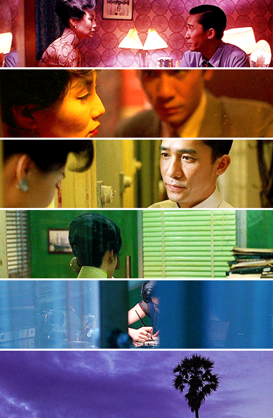 The many colors of In the Mood for Love (2000)
The Color of Pomegranates (1969)
What Dreams May Come (1998)
Symbolism
Certain colors are traditionally associated with a concept (e.g., white for purity or green for jealousy). Different cultures may ascribe different symbolic meanings to a color (e.g., white is the color of death in some cultures, whereas black is in others.) A director may also create a “private” color symbolism (also known as a leitmotif, mentioned later) for certain characters or objects.
 Edward Scissorhands (1990)
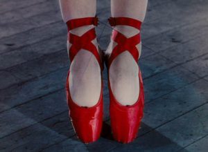
The Red Shoes (1948)
Transition
Directors may use color as a transition between various parts of a film. A bright, sunny film may shift to darker colors after a character dies, for instance.
Wings of Desire (1987; transition about halfway through)
The Purple Rose of Cairo (1985)
Irony
Directors may select colors that convey the opposite feeling of the action’s mood. For example, a supposedly passionate scene might be portrayed in cool colors that suggest that one of the characters is not that “into” the other despite appearances.
Dev. D (2009)
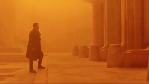 Blade Runner 2049 (2017)
Flares
Sometimes, cinematographers use an extreme amount of light that distorts the image. Such flares (or light leaks) reinforce a scene’s psychological mood.
 Star Trek (2009)

The Tree of Life (2011)
Surrealism
Sometimes filmmakers will use color to try to get inside the mind of a character.
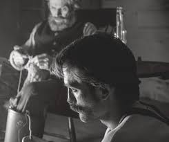
 Taxi Driver (1976)
Leitmotifs
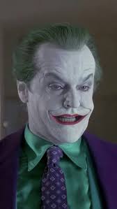
If a character has a trademark look, often times the colors will be repeated, and they tend to tell us something about the character’s personality. Consider different versions of the Joker in Batman (1989) and The Dark Knight (2008) films and how the different directors used the look of the joker in similar yet different ways.

Color to Enhance Mood
Filmmakers will carefully choose color hues to create a particular mood they are looking to infuse into the scene.
 Titanic (1997)
Painterly Effects in Color
Filmmakers sometimes try to blend colors in the same way a painter does, and in doing so they achieve a palette that mimics artistic paintings.
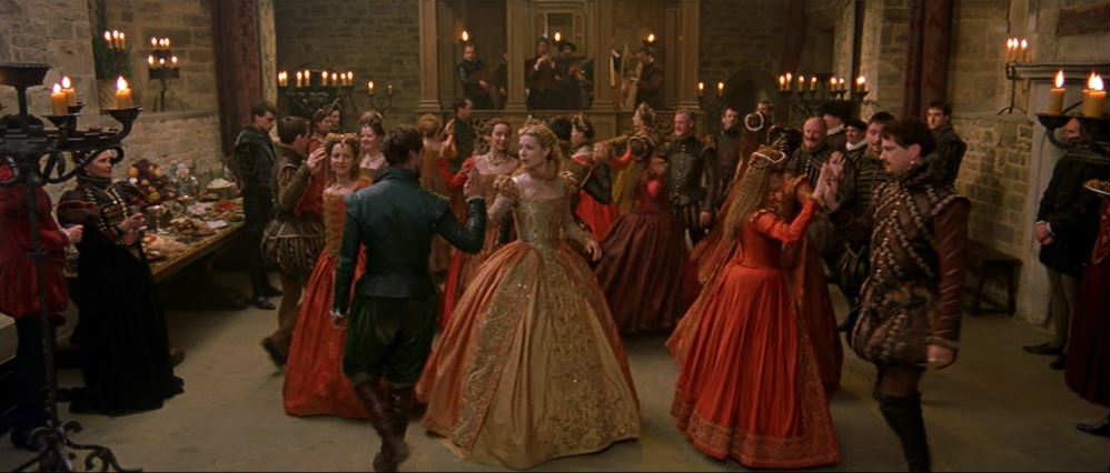 Shakespeare in Love (1998)
Comic Book and Comic Strip Color
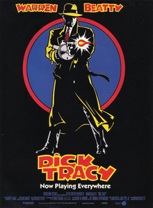
Sometimes filmmakers are trying to recreate the look of a comic book (using deep blues, blacks, grays, reds and pinks). The Spider-man image shows the comic book look below. Other times filmmakers are going for the look of a comic strip focusing on more crisp primary colors (using red, blue, yellow, purple, orange, green, and pink). The Dick Tracy image shows the comic strip look below.

Black and White
Contemporary directors may choose to forego color for any number of reasons, one of which is to dispense with the need for realism. Black and white compels cinematographers to pay more attention to subtle effects and contrasts caused by light and shadow. Line and texture become more important than they do in a typical color film. Some modern black and white films also add spots of color for emphasis.
The Lighthouse (2019)
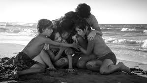
Roma (2018)
A special concept related to black and white cinematography, chiaroscuro, refers to strong contrasts between light and dark. A group of filmmakers known as German Expressionists first explored this technique systematically, and their films influenced the film noir style, which used chiaroscuro extensively.
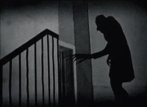
Nosferatu (1922)
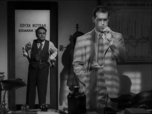
Double Indemnity (1944)
Technology
Improvements in film color are directly linked to advances in technology. Film stock, film processing techniques, diffusion techniques, filters, and other variables directly impact how a cinematographer can manipulate color on the screen.
A note about sources
- https://uark.pressbooks.pub/movingpictures/chapter/cinematography/#chapter-191-section-2 ↵
- https://uark.pressbooks.pub/movingpictures/chapter/cinematography/#chapter-191-section-2 ↵
- https://pressbooks.cuny.edu/globalfilmtraditions/chapter/chapter-3-mise-en-scene/ ↵
- https://pressbooks.cuny.edu/globalfilmtraditions/chapter/chapter-3-mise-en-scene/ ↵
- https://rmit.pressbooks.pub/colourtheory1/chapter/colour-correction-and-grading-in-photography-and-film/ ↵
- https://rmit.pressbooks.pub/colourtheory1/chapter/colour-trends/ ↵
- https://rmit.pressbooks.pub/colourtheory1/chapter/colour-trends/ ↵
- https://rmit.pressbooks.pub/colourtheory1/chapter/colour-correction-and-grading-in-photography-and-film/ ↵
- https://ohiostate.pressbooks.pub/introfilm/chapter/mise-en-scene-ii-lighting-color/ ↵
- https://ohiostate.pressbooks.pub/introfilm/chapter/mise-en-scene-ii-lighting-color/ ↵