4 Visual Design (mise-en-scène)
What Is Visual Design?
The term mise-en-scène is a French phrase translating roughly as “putting in the scene” or setting the stage.[1] As a critical term, it derives from the much older art form of theater, where it served as a way of describing the cumulative impact of everything the audience sees on stage in a play or an opera: costumes, sets, lighting, movement of the actors, etc. Of course, film is as a rule much more visually dense than theater because it is a photographic medium, and one that allows for a telescopic intimacy theater cannot afford even those in the front row: the close-up, the insert-shot, slow motion, freeze frame, etc. The unrelenting gaze of the camera’s eye means that everything is noticed—if not the first time by everyone in the audience, by someone, always, and eventually—through countless viewings and documentations of details in sites like imdb.com—by everyone who cares to find out where to look. In short, mise-en-scène refers to a film’s visual design. What do we see in the frame? What visual patterns do we see in the film as a whole?[2]
Collaborating with set designers, lighting technicians, costumers, and many other specialists, the cinematographer and director control how the various parts of the film are laid out on the frame into a (usually) unified whole. The visual design of a film helps bring the screenplay to life, and it contributes to the overall tone and texture of the movie. A film’s overall visual design, therefore, should generally reflect the movie’s narrative world, whether hyperrealistic or stylized, recognizable or otherworldly. Films will often draw on—or consciously push against—generic conventions of visual design. For instance, musicals will often employ stylized, pastel sets that conjure up theatrical productions while horror films will invariably use isolated locations such as an abandoned mental institution, remote cabin, or decrepit warehouse.
Gilles Deleuze offers a helpful set of terms that assist viewers in detecting some of these patterns: saturation and rarefaction. At the most basic level, a saturated frame contains an abundance of visual information, while a frame displaying rarefaction includes minimal visual information (at its extreme, a rarefied frame will be a black screen.) While a saturated visual design does not necessarily employ deep focus—a technique whereby the viewer can see everything from the front of the frame to the back of the frame clearly—the two techniques are often linked. Similarly, shots using rarefaction often employ shallow focus, a camera technique that blurs part of the screen and thus compelling the viewer look at only one segment of the frame.
When thinking about mise-en-scène, we are talking about decisions primarily made in the preproduction process—even quite late, often very close to the beginning of production.[3] And of course aspects of mise-en-scène bleed over into production as well. There is sometimes debate about what falls under the umbrella of mise-en-scène, but all definitions would agree on the following components:
Settings/Set design
Props
Costume
Hair and makeup
Lighting
Staging and composition (how bodies are arranged and move in the filmed setting)
Most definitions will also include the following:
Acting
Film stock
Aspect ratio
Depth
It can get a bit confusing, especially because critics can define the term somewhat differently in terms of what they think should be included and what should not. But we must recall that this is a critic’s term, a way of describing an overall effect that can then be reverse engineered in analysis to better understand its magic. Aligning the critic’s concept of mise-en-scène with the stage of production we call “pre-production,” it is easier to simply define it as: everything placed in front of the camera—including actors. Depending on the film, certain of these elements might be more important in their role to contributing to the visual presentation and overall “look” of a movie. But all of the above can play a crucial role.[4]
Here is Matt Crawford’s handy guide to visual design.
Setting
Nothing we see on the screen in cinema is there by accident.[5] Everything is carefully planned, arranged and even fabricated – sometimes using computer generated imagery (CGI) – to serve the story and create a unified aesthetic.
That goes double for the setting.
If mise-en-scène is the overall aesthetic context for a film or series, setting is the literal context, the space actors and objects inhabit for every scene. And this is much more than simply the location. It’s how that location, whether it’s an existing space occupied for filming (i.e., shooting on location) or one purpose-built on a soundstage or backlot, is designed to serve the vision of the director. Whether filmed on location or on a soundstage, settings may be interior or exterior.
Set design is exactly what is sounds like, the design and construction of the setting for any given scene in a film or series. Plenty of productions use existing locations and don’t necessarily have to build much of anything (though that doesn’t mean there isn’t an element of design involved, as we shall see). When a production requires complete control over the filming environment, production designers, along with conceptual artists, construction engineers, and sometimes a whole army of artisans, must create each setting, or set, from the ground up. And since these sets have to hold up under the strain of a large film crew working in and around them for days and even weeks, they require as much planning and careful construction as any other real-life home, building, or interplanetary city out there in the universe.
Of course, sometimes the setting of a particular production requires more than a production designer can deliver with the materials available (or the time or the budget as the case may be). In that case, the setting must be augmented with computer generated imagery (CGI). The most common way this is implemented is through the use of green screen technology. The idea is fairly simple. The set is dressed with a backdrop of bright green (or blue, the actual color isn’t terribly important) and the scene filmed as usual. Then, in post-production, software picks out that particular color and replaces it with imagery either filmed elsewhere or generated by digital artists, a process called keying. For this to work, no other object or article of clothing can match that shade of green, or it will be replaced as well. And with ever-improving technology, the sky is no longer the limit to what designers can offer up for the screen.
Whether the production designer is building the set from the ground up on a soundstage, or simply using an existing location, the setting is still a kind of blank canvas until that space is filled with all of the important details that really tell the story. That’s where set design meets set decoration. Still under the supervision of the production designer, set decorating falls to any number of skilled artisans in the art department. And they design everything from the color on the walls, to the texture of the drapes, to the style of the furniture, to every ashtray, book and family photo that might show up on screen. That goes for existing locations as well. A film production using someone’s actual home for a scene will likely replace all of the furniture, repaint the walls, and fill it with their odds and ends chosen to help tell the cinematic story.
This is where storytelling through the physical environment – the setting – can really come alive. Every object placed just so on a set adds to the mise-en-scène and helps tell the story. Those objects could be in the background providing context – framed photos, a trophy, an antique clock – or they could be picked up and handled by characters in a scene – a glass of whiskey, a pack of cigarettes, a loaded gun. We even have a name for those objects, props–short for “property” and also borrowed from theater–and a name for the person in charge of keeping track of them all, a prop master.
As should be clear by now, setting is one of the most important design elements in creating a consistent mise-en-scène. Not simply the location – a suburban home, a high-rise office building, a spaceport on Mos Eisley – but all of the details that fill that location, make it come alive as a lived-in space, and most importantly, help tell the cinematic story. One way we can begin to really see the intention of the filmmaker, to understand how she is subtly (and maybe not so subtly) manipulating our emotions through cinematic language, is to pay attention to these details. The very details we’re not supposed to notice.[6]
In examining the setting as it relates to the story, Dennis W. Petrie and Joseph M. Boggs remind us that it is necessary to consider the effect of four factors on the story as a whole:
“Temporal factors: The time period in which the story takes place
Geographic factors: The physical location and its characteristics, including the type of terrain, climate, population density (its visual and psychological impact), and any other physical factors of the locale that may have an effect on the story’s characters and their actions
Social structures and economic factors
Customs, moral attitudes, and codes of behavior
Each factor has an important effect on the problems, conflicts, and character of human beings and must be considered as an integral part of any story’s plot or theme” (85).
Petrie and Boggs also point out several ways that setting may impact a film:
Setting as Determiner of Character
–Potentially the environment a character is surrounded by has significant impact on who that character becomes. The place they came from, the social class they were a part of, the time period they lived in, among other things, all have a place in determining who the character is and how they respond to situations.
Setting as Reflection of Character
–In a similar way, as viewers we can look at a character’s surroundings and try to understand the character better because of what the environment tells us about them. The viewer has to consider how the setting is at play–whether it’s creating aspects of a character’s personality or simply reflecting them.
Setting for Verisimilitude
–Filmmakers take great pains in developing and designing realistic sets that accurately depict the world in which their characters live.
Setting for Sheer Visual Impact
–Because film is a visual medium, filmmakers often choose destinations that can captivate an audience with the sheer visual impact the location offers. Consider how New Zealand was used as the backdrop for The Lord of the Rings Trilogy. The beautiful location created a world for those characters that couldn’t be any more visually pleasing to the eye.
Setting to Create Emotional Atmosphere
–Potentially the setting is used to create a mood that permeates the entire film. Horror films, for example, often use low-key lighting, many shadows, and eerie architecture elements as part of the visual design choices. Filmmakers do so because viewers feel the suspense and fear due to those elements being present throughout the film.
Setting as Symbol
–Filmmakers may use the setting to symbolize something and add layers of meaning to the film’s plot. Consider the many ways in which some part of the setting might mean something more than just what it is. For example, the monotonous cubicles in the main work building showcased in Office Space not only give the characters a place to go each day for work, but they represent the boredom and meaningless existence the characters are struggling with throughout the film.
Setting as Microcosm
–This idea occurs when filmmakers take a small group of people and/or place and use them to represent a larger understanding of human behavior, suggesting that what occurs there shows the true human condition. If you take an example like the television series Lost–the island they are stranded on becomes their world, and the people there each take on roles of leader, nurturer, rebel, etc…mimicking how the world in general has all different kinds of people forming our societies.
(85-89)
SPACE
Cinematic space includes the physical area surrounding the characters and props, but it also functions as a dynamic element that can influence the narrative, character development, and the emotional tone of the scene. Space can provide a visual “shorthand” for the viewers in assessing socio-economic conditions and hierarchies. In helping to establish a character’s (or group’s) psychological state, moreover, a director or cinematographer will often manipulate space so that it suggests emotional states such as alienation, intimacy, danger, happiness, or freedom. Space can also impact how an audience responds to a character or situation.
Characters (and objects) will engage with space in diverse ways. They may, for example, remain relatively static (e.g., lounging on a sofa or standing still) or they may move with relative degrees of speed (e.g., a leisurely stroll or a panicked sprint.) Further, some characters may project a feeling of comfort and security as they interact with space (e.g., gently brushing a flower while sitting in a meadow or exhibiting mastery over the tools of their trade), while others seem resentful or fearful of the space they inhabit (e.g., sitting with stiff posture and folded arms or anxiously looking at a locked door.)
Offscreen space (outside the frame) can also play an important role in generating tension. For example, we might anticipate a conflict because we can hear a monster but not see it. As the cinematographer reframes the scene, elements of the (previously) offscreen space may now appear on screen. Our monster’s foreclaw, for instance, might now become visible to the viewers and suggest that a confrontation is imminent.
COSTUME DESIGN/HAIR/MAKEUP
We often think of “costume” as another word for disguise or playing a character.[7] But the last thing a filmmaker wants is the audience to think of their characters as actors in disguise or playing dress-up. They want us to see the characters. Period. The wardrobe should fit the time and place, and most importantly, the character. And once that is established, the designer can layer in more subtle hints about the larger context, the underlying theme, by adding a touch of color that serves as a visual motif or introducing some alteration in the wardrobe (for example, in color, style or fit) that dramatize some narrative shift.
What is important to note is that costume design in film is not about fashion or even what looks “good” on an actor. It’s about what looks right on a character, what reinforces the character’s identity or self-image, and what fits the setting and the overall look of the film.[8] While costume and make-up designers often strive for realism, they may also use techniques that elaborate, exaggerate, or employ irony in order to emphasize a state of feeling or being that is embedded in fantasy or psychological states.[9] These choices will work in tandem with the actor’s performances to articulate deeper meanings and generate a complexity of emotions in the audience.[10]
As with costume design, it’s easy to think of the more extreme examples of hair and make-up design, especially when the setting calls for something historic or other-worldly or… horrifying.[11] The special effects make-up for the gory bits of your favorite horror films can sometimes take center stage, but more often these elements are not meant to draw our attention at all. To achieve that, perhaps ironically, hair and make-up require even more attention from their respective designers. This is due in part to the technical requirements of filming. Bright lights that can reveal every distracting blemish or poorly applied foundation, and as camera and image technology improves, the techniques required to hide the fact that actors are even wearing make-up must be continually refined. But it is also because hair and make-up are incredibly personal and intimately connected to the character.[12]
Now You See It on costume design
Lighting
Many film scholars discuss lighting under the umbrella of cinematography. Nonetheless, lighting is perhaps the most basic element of what we see–or can’t see–on the screen and thus serves as a key element of visual design.
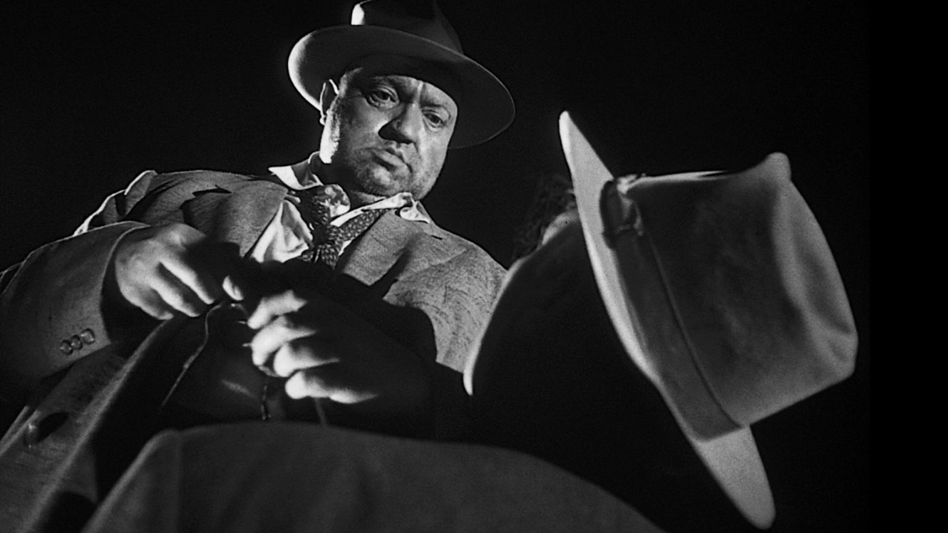
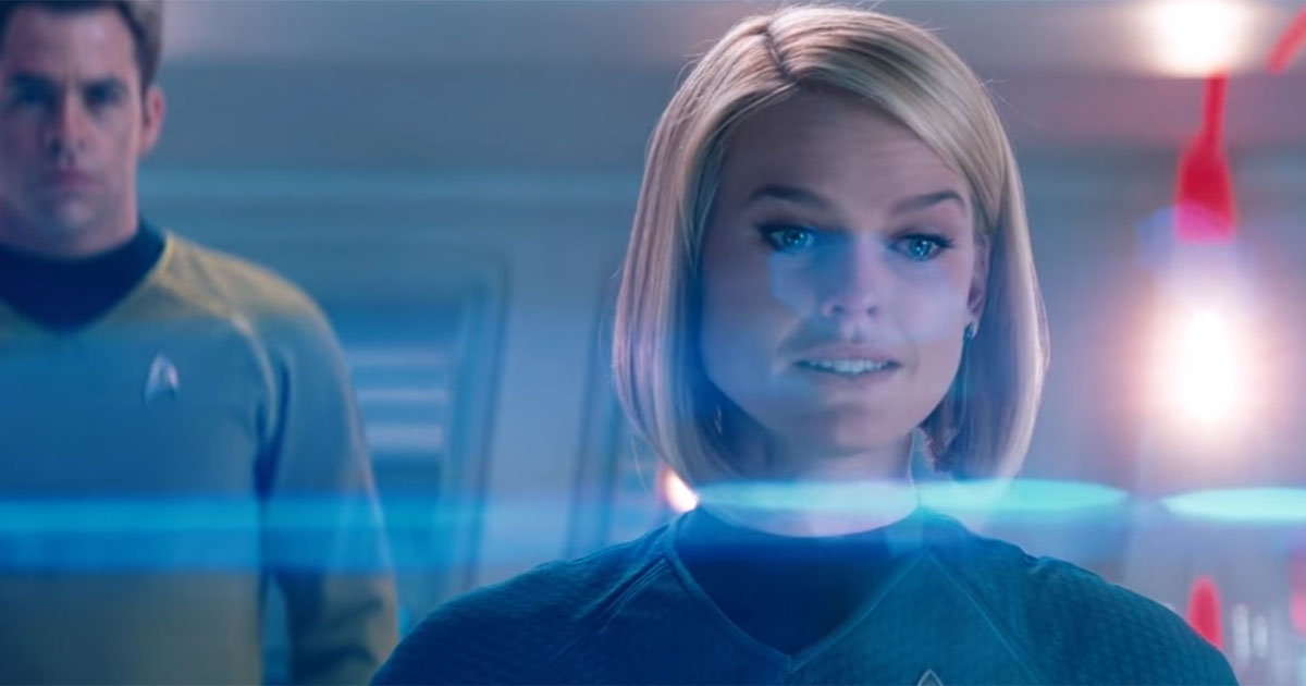
We all have language at hand to discuss the effect of lighting in a film.[13] We might ask a roommate, for example, to close the blinds while watching Touch of Evil (1958) because the movie is “so dark.” Or we might complain to a friend about the lens flares in Star Trek (2009) because Abrams’s love of the technique is giving you headaches.

- Touch of Evil
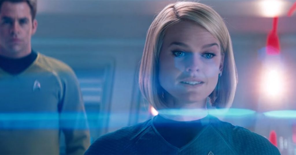
- Star Trek
Lighting is something we all already know deeply impacts our moods as human beings (never is this more clear than as we head towards winter when light will be in such short supply). We can be “blinded” by light or “energized” by it. Its sudden absence can trigger primal fear, and its gradual amplification often inspires feelings of hope for the future. As much as trees and plants, we respond to light in highly sensitive—often deeply hardwired—ways, and a good lighting designer in a film knows how to work with the director, production designer, and cinematographer to paint an emotional story with light and darkness.
Of course, lighting also serves more explicitly narrative functions, such as directing the viewer’s eye to an important object or event, or obscuring a detail that will only be revealed later. In traditional character-driven narrative film, the lighting is almost always first and foremost focused around the main actors and their movements. This is why the cinematographer is intimately involved in discussions of lighting design, even though lighting is part of the preproduction process and cinematography officially begins at the production stage. The cinematographer, or Director of Photography, needs to know how the actors and settings are going to be lit in order to make decisions about shutter speeds, camera movement, and (if using traditional film) film stock or (if shooting digitally) camera sensors and lens ISOs. We will talk about the work of the cinematographer and their team later, but one of the reasons lighting design is usually a late part of the preproduction process is that lighting inevitably bleeds into production. Decisions about how to light a scene cannot be finalized until all the sets are built and dressed, costumes made, makeup choices established, etc. The lighting team needs to plan, but it also needs to be on the set to make adjustments in response to choices the director, actors, and cinematographer opt for once shooting begins.
So, how does film lighting work? As we can with most film elements, we might consider the history of the development of film lighting, as it shows how experimentation and discovery led to the establishment (and ongoing evolution) of certain conventions.
In the early years of cinema, films depended almost entirely on daylight for their lighting source. Part of the reason the film industry moved from the East Coast (primarily New York and New Jersey) to Hollywood, California in the late 1910s involved the need for more daylight (Hollywood has about 80 more sunny days a year than Fort Lee, New Jersey, where the film industry in the U.S. first set up shop).
That said, daylight has its disadvantages. First, it is very unpredictable. An early film shoot could be derailed entirely by a cloudy day or a sudden storm, and the movement of clouds across the sun could alter the lighting in disorienting ways in the middle of a shot. In addition, daylight was hard to direct. The earliest film studios, such as Edison’s famous “Black Maria” brought sunlight in from the ceiling, using a shutter to try and control the amount of light as conditions changed. Edison and others soon scrapped this approach in favor of rooftop studios with glass walls and ceilings, as well as screens to control and direct the light as much as possible. The results were that everything had a uniform lighting, and there was little thought that lighting could be anything other than something necessary to ensure that the image was able to be captured on film.

- Edison’s Black Maria, built in 1893

- Lubin Studio in Philadelphia, 1899
Artificial lights were introduced along the way to try to provide dramatic effects, but for a long time they had a hard time competing with the sunlight necessary for the very slow film speeds of the earliest film stock. A film’s “speed” is simply a measure of its relative sensitivity to light. Since film requires light to produce the image on the negative, a “slower” film speed, which is less sensitive to light, needs brighter lights or, in the case of still photography, longer exposure time. There are other differences in the look and feel of slower or faster film stocks as well, but in the early years of film there was no real choice: they were all slow, which required bright light—and for some time the only light consistently bright enough was the sun.
After 1910, carbon arc lamps began to be used in film production. These lamps were very bright (and very harsh), but directors found ways of using his harshness to create unique effects similar to those of the chiaroscuro (or, shadowy) paintings of the late Renaissance. Here are on the left below are two examples of chiaroscuro in painting, followed by one, on the right, of how that effect came to be imitated in early film:
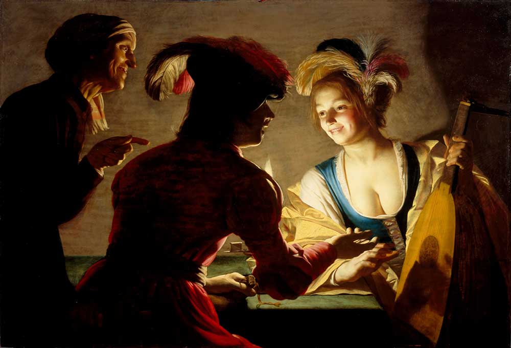
- Gerritt van Honthorst, The Matchmaker (1625)
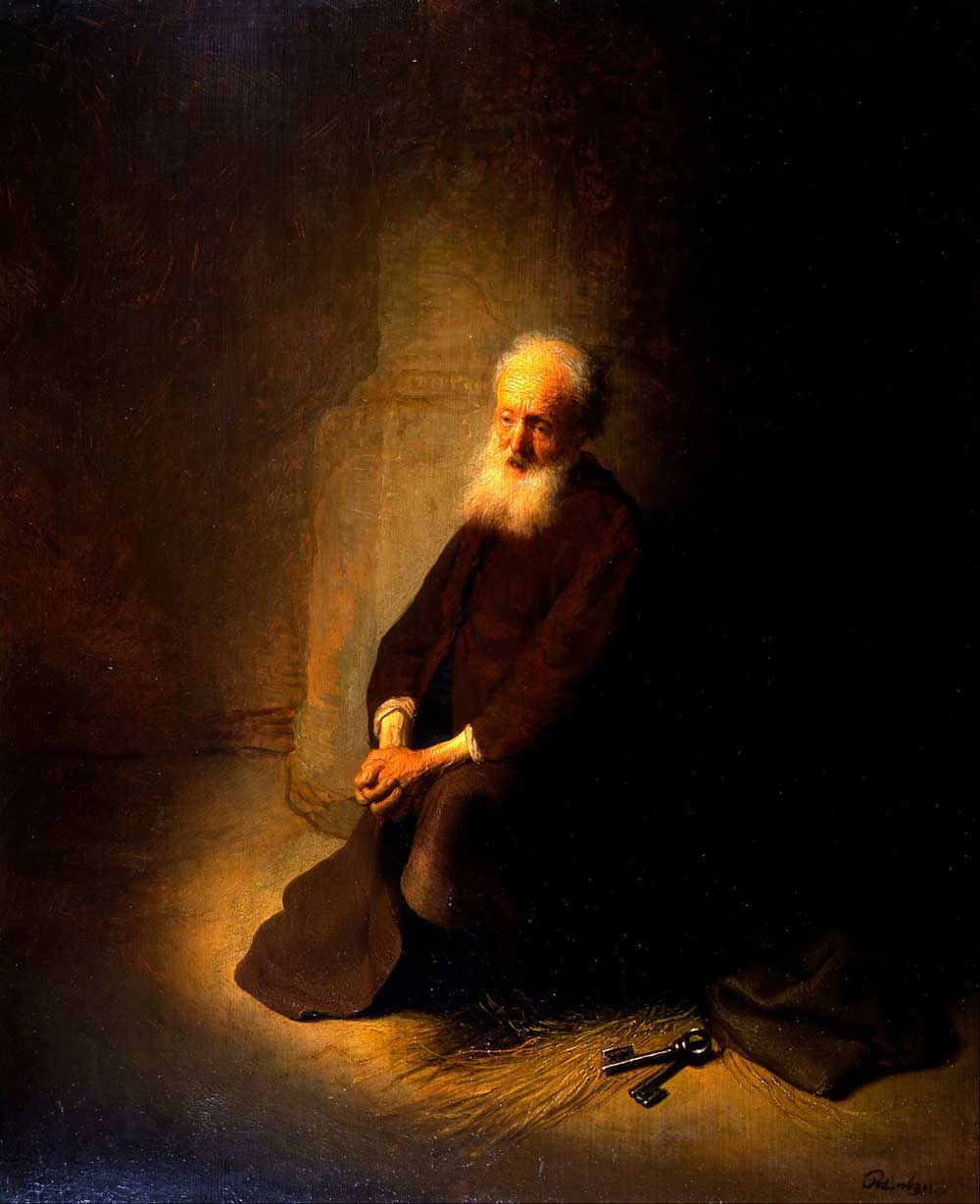
- Rembrandt, St. Peter in Prison (1631)

- The Cheat (dir. Cecil B. Demille, 1915)
As you can see from these examples, the chiaroscuro style reproduced in the medium of paint a strong source of bright light in an otherwise dark space, allowing shadow to stand in sharp contrast to the light. Pioneered especially by Cecil B. DeMille in his post-1914 films, this style of lighting started being adapted in the medium of film via arc lights casting a sharp light in one direction while the other side remains unlit.
This is the beginning in Hollywood of using lighting for expressive effects, although examples even earlier can be found in other cinema traditions around the world. Eventually in the U.S., the emotional extremes of early film lighting would give way in the 1920s and 30s to the conventions of what is known as three-point lighting, with more even, neutral effects. The chiaroscuro approach, however, would remain in use for certain genres (horror, film noir) to the present.
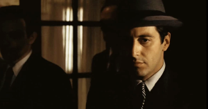
- The Godfather (1972)

- Sin City (2005)
While the chiaroscuro approach was effective for creating expressive effects with artificial lighting, it clearly did not lend itself to all genres or moods. Chiaroscuro lighting is not particular conducive for comedies or musicals, for example. As a result, lighting designers began to experiment with different kinds of lights in different combinations, adding diffusers and reflectors to better control the gradations between the brightest whites and the darkest blacks.
The standard in the Hollywood system became known as three-point lighting (even when there are, as is often the case, more than three light sources involved). The first major light in this system is the one Wilfred Buckland had experimented with in creating the “DeMille lighting” of the early studio era. This became known as the key light. In order to soften the hard fall-off from this light into the shadows beyond, a second light is introduced, known as the fill light. This light exists on the opposite side of the subject from the key light and is softer and more diffuse—thus retaining the sense of direction of the primary light without pushing more than half of the subject into shadow. Finally, we have the back light; this light serves to separate the subject from the background. The standard setup looks something like this:

Three-point lighting
This video explains three-point lighting in more detail:
You can see the ways in which adjusting the level of both the backlight (directed at the subject from behind) and the background light (pointing back at the background) can make a subject “pop” in the clip from Vertigo (1958) below. Here our protagonist is seeing the woman who is going to occupy his every thought for the next many months, first as an assignment and then as an obsession:
Obviously there is a lot going on in this brief scene. Camera movement forges the connection between Kim Novak’s Madeleine and James Stewart’s Scottie, and even before we know who he is there to find, costume has pulled Madeleine out of the many diners in the restaurant. By itself, the green of her dress would not be sufficient to make Madeline glisten like an emerald in its setting: it is the lighting that pulls her out of the crowd even more than the costume. Once she walks into the bar where Scottie is sitting, pausing to wait for her husband to catch up, first the backlight is turned way up (creating a kind of halo around her hair) and then the background light, separating her from the restaurant and seeming to make time—for Scottie and for us—momentarily stop. This scene in fact is an excellent example—one with little dialogue—of production design (costume, movement of actors, and especially lighting) doing an incredible amount of narrative work that has little to do with words on a screenplay.
As we have seen, the three main lights—key, fill, and back—are a shorthand for a myriad of combinations. The lights can be angled, diffused, increased and decreased in intensity to create a range of different effects. Our goal as film students is to try and think about the positioning of the lights (for example, where is the primary source of illumination—or the key light—positioned in relation to the primary subject?) and anything unusual in their balance that calls attention to itself (as in the above scene). In much narrative film, the look and feel of the lighting is fairly “neutral”—an even lighting that does not call attention as being particularly meaningful. Predictably, we call this neutral lighting: where the lighting is even and balanced throughout the frame.
Some lighting jumps out as being far from neutral. This is especially the case with what we call low-key lighting. Often the back light is eliminated entirely, and the effect is very similar to what DeMille was after in 1915 in The Cheat. We see this at play in some key scenes in Citizen Kane (1941), and it is most closely associated in 1940s and 50s Hollywood with film noir, which borrowed some of its techniques from Kane as well as from German Expressionist films from the 1920s.
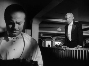
Citizen Kane
In fact, part of the reason low-key lighting would emerge during the wartime 1940s was that lights were being rationed and budgets greatly reduced as part of the war effort. Low-key lighting allowed them to cut budgets on sets by not lighting (and therefore, not building) the backgrounds, keeping the emphasis on the characters and their psychological drama—a drama represented subjectively in the lighting itself.
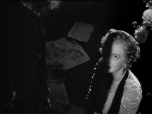
In Out of the Past (1947), the film switches between a neutral lighting scheme for Jeff, the protagonist, in his current happy life with Ann to a heavy use of low-key lighting for the scenes set in his past with Kathie. Below we see Jeff with Ann and, on the right, with Kathie, in the past:
- Jeff with Ann

- Jeff with Kathie
In the first image, we see a wide range of grays across the spectrum. Contrast—the range between the blackest black and the whitest white—is low and evenly gradated. This is an example of neutral lighting. On second image, however, we see major portions of the frame completely in darkness and the unsoftened angular light on the right side of Kathie’s face only calls attention to the darkness that envelops Jeff (and the other half of her face). We can reverse-engineer the lighting here, seeing a strong keylight up over Jeff’s shoulder on the right of the screen, and a moderate background light to illuminate the background gently and create a sense of the depths of the space. Aside from a reflector or two to target the light a bit more precisely, that was probably it. The first shot, however–despite being shot outside–probably had a half dozen lights around the figures to illuminate faces evenly and separate them from the rural landscape behind them.
We can see the contrast between high- and low-key nicely in Wild Strawberries (1957), in which the protagonist, an aging professor, explores happy memories of his childhood (in the first still below) and sad memories of his failed marriage (in the second still below). The memories of his childhood vacation home are brightly lit, across a wide range of whites set up to brightly and evenly light all surfaces. We see few grays and fewer blacks (the white costumes and table settings of course amplifying the effect).

- Happy memories (high key lighting)

- … and sad (low key lighting)
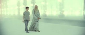
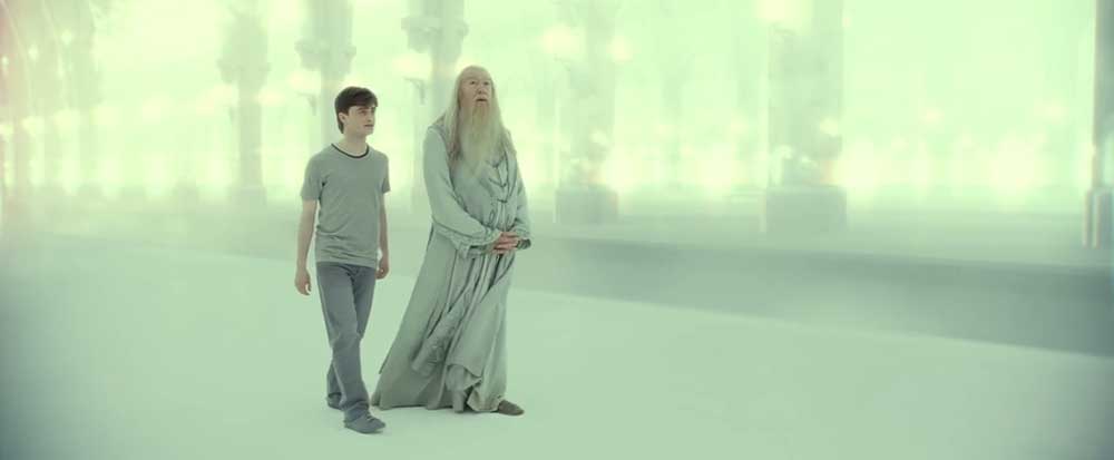
In the 1940s and 50s, high-key lighting began to be commonly used for movies associated with lighter fare or directed towards children, and even today when we see a film with bright, even lighting we often assume a lighter tone to the film (an expectation which can, of course, be used to surprise the viewer when the tone turns suddenly dark). High-key lighting can also be used to convey fantasy or a space apart from the more neutral lighting of the rest of the film, as in the scene of Harry’s other-worldly visit with Dumbledore in Harry Potter and The Deathly Hallows Part 2 (2011).

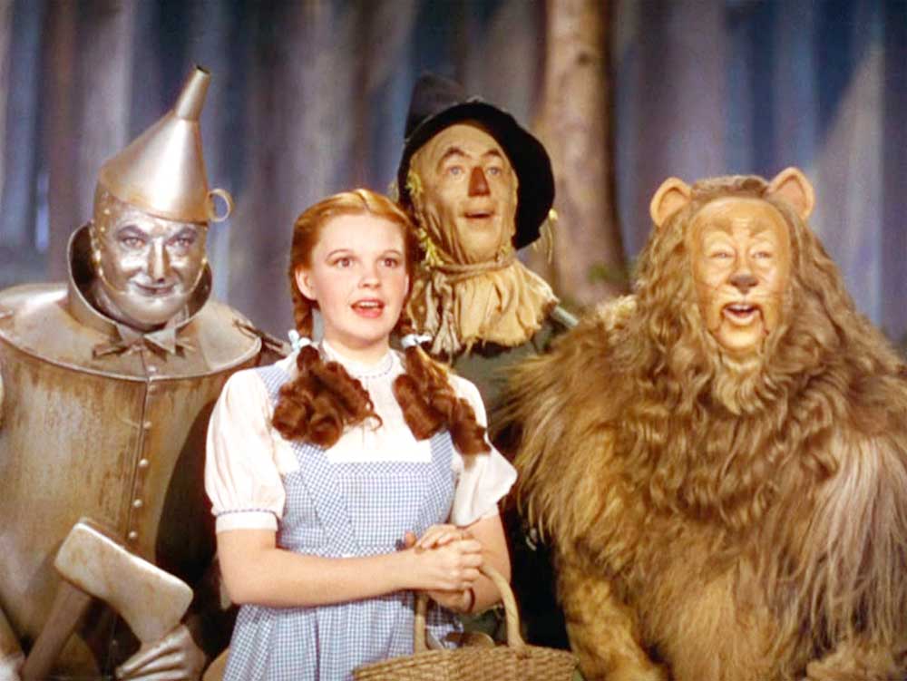
- Wizard of Oz (1939)
- Harry Potter and The Deathly Hallows Part 2
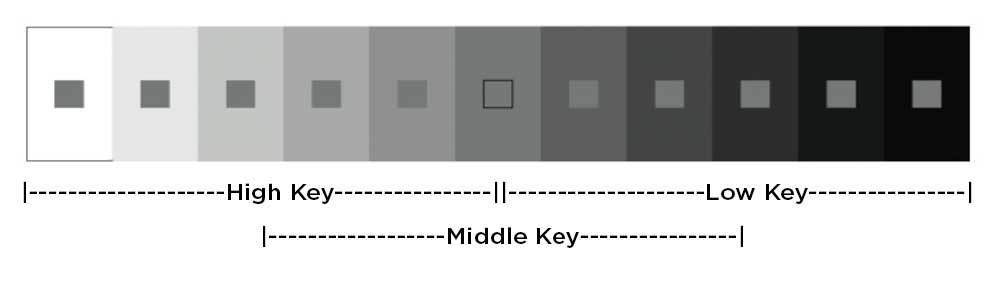
| high-key lighting | low-key lighting |
| low contrast | high contrast |
| bright highlights dominated by range of whites | deep blacks, darker tones, and shadows |
The table above offers us some descriptive language to capture the effect of high-key and low-key lighting in film. Of course, the majority of shots we will see in most films fall in between, in the middle ranges of the spectrum between the highest highs and the lowest lows:
 Thus, we might find ourselves also thinking about an aspect of the lighting designer’s work that plays out more in the range of color palette. Increasingly in the digital age, a lot of color refinement happens in post-production, as computer color grading allows for the creation of remarkably uniform or deliberately clashing palettes of color in the final image on the screen. But long before there was digital editing, and even today in the era of digital photography, colorwork is happening in the lighting setup as well.
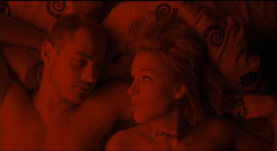
In addition to using standard lighting sources, cinematographers will frequently employ gels as well. Gels are sheets of heat-resistant transparent plastics placed over a lamp to color the light it projects. Using gels is an extremely old practice, long employed in theater to help convey mood or atmosphere through the coloring of the lights projected down on the actors. Even in the age of black-and-white movies, before color became the standard, it was quickly discovered that colored gels changed the feel of the black-and-white photography. Once color film was introduced, cinematographers and technicians conducted extensive experimentation to determine what impact different colored lights had on different color film stocks.

- Run Lola Run (1999)
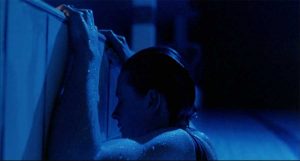
- Blue (1993)

Most often gels are used for more subtle effects, but they are almost always in use. In fact, gel colors go through periods of being in or out of fashion, and one way to identify the period of a film for someone with a better eye than we possess would be to identify the gel being used. Blue gels (and additional color gradation) was commonly used in the first decade of the 21st century, so much so that it became identified as an overused trope in popular criticism:
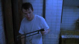
- Saw (2004)
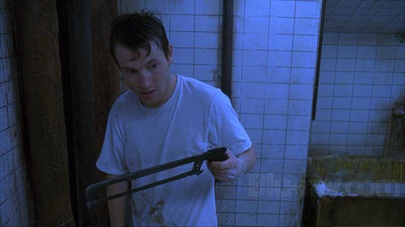
- Minority Report (2002)

Despite criticism of its overuse, it remains in use today, especially in a lot of “gritty” television drama.
COMPOSITION/BLOCKING
Composition (sometimes called blocking) refers to the arrangement of people, objects and setting within the frame of an image. Because we are talking about moving pictures, there are really two important components of composition: framing, which even still photographers must master, and movement (sometimes called kinesis.) In the case of cinematic composition, movement refers to activity within the frame reframing as the cinematographer moves the camera through the scene. These movements are critical aspects of how we experience mise-en-scène.
Like lighting, composition often falls under the responsibility of the cinematographer. While there are many technical and artistic considerations when it comes to framing and movement, cinematographers are also keenly aware of the design element of composition. In fact, they often describe at least part of their job as designing a shot. Part of this process involves arranging people, objects, and setting in the frame to achieve a sense of balance and proportion, often dividing the frame into thirds horizontally and vertically to ensure proper distribution. We call this the rule of thirds and it’s fairly common in photography. In fact, take out your phone right now, open the camera app, and you’re likely to see a faint grid across the screen. That’s there to help you balance the composition of your selfie according to the rule of thirds. Another important part of the process of designing a shot is the choreography involved in moving the camera through the scene, whether on wheels, on a crane or strapped to a camera person.[14]
A note about sources
This textbook reuses, revises, and remixes multiple OER texts according to their Creative Commons licensing. We indicate which text we are adapting with a footnote citation before and after each section of text. Additionally, we employ a number of non-OER sources. We indicate these using standard MLA citation. Full source information for both OER and non-OER sources appear in the works cited. Additionally, video clips link to their original source.
- https://ohiostate.pressbooks.pub/introfilm/chapter/mise-en-scene-part-1-setting-design-staging/ ↵
- https://ohiostate.pressbooks.pub/introfilm/chapter/mise-en-scene-part-1-setting-design-staging/ ↵
- https://ohiostate.pressbooks.pub/introfilm/chapter/mise-en-scene-part-1-setting-design-staging/ ↵
- https://ohiostate.pressbooks.pub/introfilm/chapter/mise-en-scene-part-1-setting-design-staging/ ↵
- https://uark.pressbooks.pub/movingpictures/chapter/mise-en-scene/ ↵
- https://uark.pressbooks.pub/movingpictures/chapter/mise-en-scene/ ↵
- https://uark.pressbooks.pub/movingpictures/chapter/mise-en-scene/ ↵
- https://uark.pressbooks.pub/movingpictures/chapter/mise-en-scene/ ↵
- https://alg.manifoldapp.org/read/film-appreciation/section/6c87565c-8398-40fd-9c82-7d9aec5ead99 ↵
- https://alg.manifoldapp.org/read/film-appreciation/section/6c87565c-8398-40fd-9c82-7d9aec5ead99 ↵
- https://uark.pressbooks.pub/movingpictures/chapter/mise-en-scene/ ↵
- https://uark.pressbooks.pub/movingpictures/chapter/mise-en-scene/ ↵
- https://ohiostate.pressbooks.pub/introfilm/chapter/mise-en-scene-ii-lighting-color/ ↵
- https://ohiostate.pressbooks.pub/introfilm/chapter/mise-en-scene-ii-lighting-color/ ↵